There is something to be said about simplicity.
It forces you to extract the purest essence of what’s being shown.
It provides the opportunity for understanding the basic structure of what’s being exposed.
It provokes the notion that complexity can be visible in straightforwardness and from that state, one can appreciate details otherwise distorted by embellishments.
But can simple be too simple?
Can simple lack excitement, rendering the product boring?
Can simple ever border on dated but serve as a logical analysis of history?
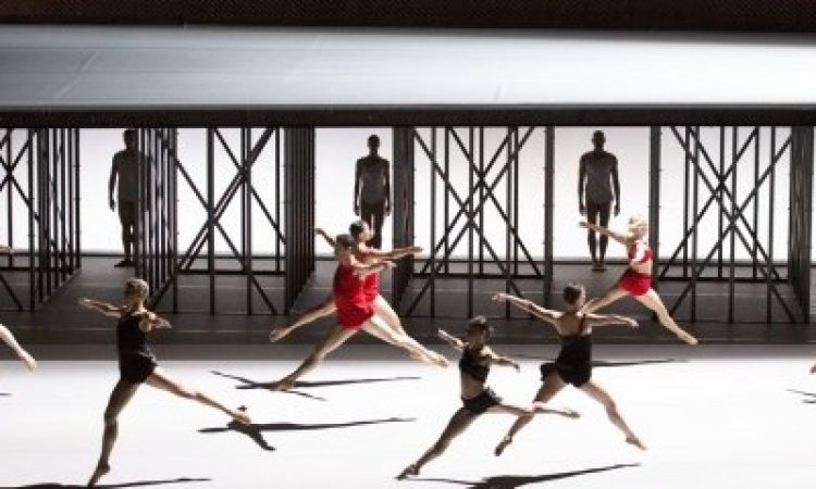
Lucinda Childs’ Available Light was a 55-minute demonstration in unaffected, unadorned simplicity. Originally commissioned in 1983 by the Museum of Contemporary Art in Los Angeles, Light celebrated its thirty-second birthday with a revival for the Philadelphia Fringe Festival.
The Drexel Armory, a cavernous space, housed a two-tiered set by Frank Gehry that rendered the dancers miniature. What appeared to be metal beams supported the upper platform and a massive chain-link fence framed the performing space as it loomed into the openness of the Armory. John Adams’ electronic soundscape filled the room with lingering echoes. The title of the piece suggested that the element of light may have been the steering wheel of this production, but it was space that became the portentous component in the choreography. Childs used diagonals with strong intention, accessing a depth of space that was only magnified by the dancers’ second position port de bras throughout the piece. There was also an allowance for use of the vertical space— the second tier platform added height to the traditional eye-level dancing arena. The wingless perimeter allowed the stage to extend past its marley boundaries and, in a way, asked the audience to become a part of the piece.
Within the space the dancers prudently executed their moves: arabesques, lunges, fouettés, soutenus and renversés – over and over and over again. I found the repetition to be a call for basic appreciation but sometimes repetition causes predictability and loss of interest. The erectness of the dancers’ torso was a not-so-subtle reminder of what some people dislike about classical ballet. Rigid and placed, this physical demeanor made it hard for me to care about the dancers and subsequently about the dance. I couldn’t connect with the dancers because their inflexible backs and emotionless stares didn’t give me permission.
Simple can be the thing that takes us back to basics; frees us from chaos and choreographic conundrum. But simplicity, with the added layer of constant repetition left me dozing off. While the audience was pleased, I found myself wondering if they genuinely enjoyed it or if they felt as if they had to like it, because after all, it was Lucinda Childs.
Available Light, Lucinda Childs, John Adams, Frank O. Gehry, The Drexel Armory, Sept. 10 -12, www.fringearts.com


